What is Brutalist Web Design
Brutalist web design has two competing philosophies, one of functionality and the other, audacity. I tend to favor the more functional style of brutalism which focuses on making a website and it’s content easy to read & navigate. It also focuses on keeping the natural functionality and responsiveness of HTML so that the amount of CSS you use to style a site is reduced. This form of web design has always stood out to me as modern web design is all about making things look good even if it means having to change the natural functionality/look of a HTML tag e.g making an anchor tag look and behave like a button.
This might come across as boring to some people, particularly those who love CSS and design in general as it might seem to them that brutalist web design is very limiting in what you can create or as some might say, boring. I however, don’t think that is the case as I believe that having rules like the ones brutalist web design introduces, when creating a web design, can produce work that stands out from the rest and can make your site more memorable as shown below.
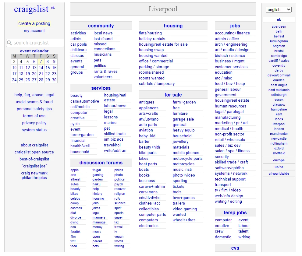
Craigslist

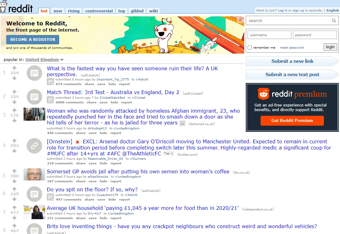
Old Reddit

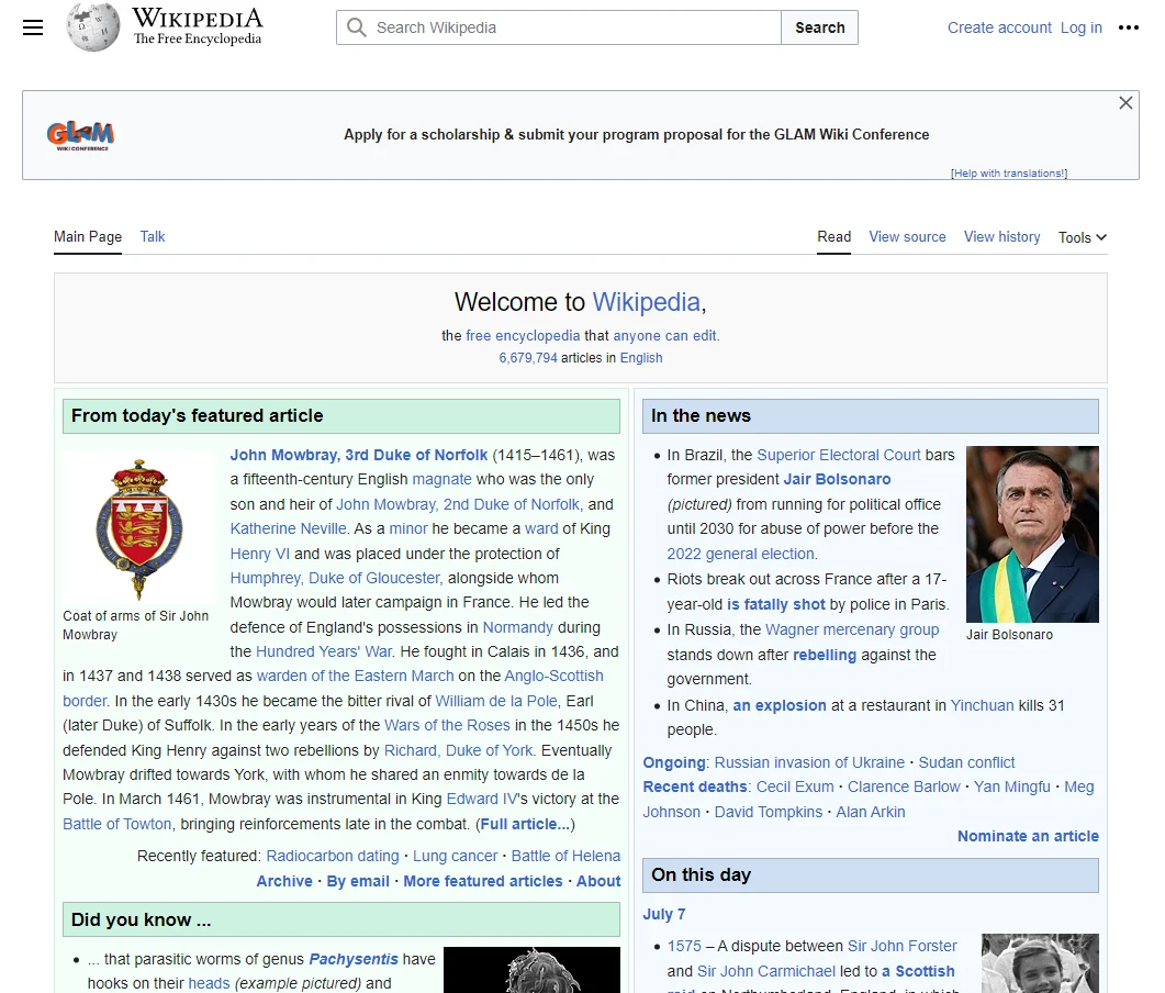
Wikipedia

Principles of Brutalism
Brutalist web design has principles that anyone implementing should follow and they include:
- making content readable on all reasonable screens and devices.
- making sure only hyperlinks and buttons respond to clicks.
- making sure hyperlinks are underlined and buttons look like buttons.
- making sure the back button works as expected.
- making all content viewable by scrolling.
- making sure you add decoration when needed and no unrelated content.
- making performance a feature of your site.
These principles were sourced from here. The site goes into more detail concerning them so I recommend you have a read if this style of design interests you.
My Portfolio
As you can see from my portfolio, I’ve utilized the principles above as much as I could while also adding a touch of my own creativity. You’ll see this in the way I style my links in the navigation to make it obvious that it is a link but also style it so that it fits in with my portfolio’s design or in the way I style my headers while also making it clear that it is a header.
I haven’t implemented pagination as I was applying the “making all content viewable by scrolling” principle but I have implemented post filtering by tags to make it a little easier to find a post. I’ve kept my colors simple but also implemented automatic dark mode so I don’t burn your eyes with the default white background color of the site’s pages. So you see, brutalist web design is pretty flexible even when working within the above principles and can be implemented by non designers like myself.
